Overview
Declarative Modals
Discover an advanced modal solution! With a declarative approach and strict typing, you'll be able to display views without needing to manage visibility states. This solution offers bidirectional communication between modal and client, allowing an infinite variety of generic logics without absorbing specific business logic. Additionally, you can expect user responses within the modal without leaving the local execution context. Best of all, its Core allows you to fully customize your user experience with tailored animations, styles, and configurations.
Demo
https://decl-modal-next-example.nazfy.dev/
Installation
- npm
- pnpm
- yarn
npm install @nazfy/modal-react
pnpm install @nazfy/modal-react
yarn add @nazfy/modal-react
Why should you use this library
This library can be a perfect replacement for react-toastify, react-modal, react-tooltip. Saving a huge amount of bundle size, and you no longer have to learn specific configurations, props, styles. You set everything up! Your configurations, your styles, your props! The fact that you have to set it up doesn't have to be complex, as in the following section, you can simply copy and paste the example containers and adapt them!
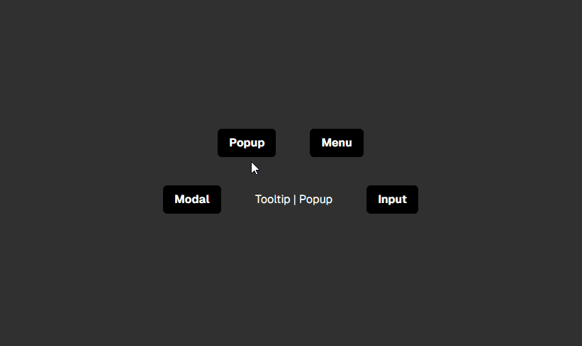
Containers to copy and paste
These containers cover the most common views you can generate with this library. You can simply copy them and then create your modals that extend from these containers, or even modify the containers
Build your own modal - Step by step
To implement a modal, start by extending your ModalProps component to ensure it has the required properties. Next, use the generateModal function from the library to create a ModalRoot, which will be responsible for rendering your modal. This ModalRoot component not only renders but also provides the modal with special properties.
Build your Modal
The first HTML element you render should be injected with the RootProps (which will be useful later for animations). The props you see here will be provided by the future ModalRoot that will render our modal.
import { ModalProps } from "@nazfy/modal"

interface MyFirstModalProps extends ModalProps {
  myCustomProp: any
}

const MyFirstModal: React.FC<MyFirstModalProps> = ({ closeModal, RootProps }) => {
  return (
    <div className='flex fixed opacity-0 bg-black bg-opacity-70 top-0 bottom-0 w-full'
      onClick={() => closeModal(false)}
      {...RootProps}>
      <div className='m-auto'>
        <div className="bg-white rounded-md p-5 font-bold">
          Hello world! :)
        </div>
      </div>
    </div>
  )
}
Generate a showMethod/ModalRoot
import { generateModal } from "@nazfy/modal/react"

// It's like useState, you can name them whatever you want.
export const [showMyFirstModal, MyFirstModalRoot] = generateModal(MyFirstModal)
Render your ModalRoot
//Render the Root wherever you want.
<MyFirstModalRoot />
Show your modal
// Simply call the show method, e.g., an onClick event
showMyFirstModal()
Next steps (Optional):
Assign an animation to your Modal
// Define the animation property in ModalRoot
<MyFirstModalRoot animation='bubble'/>
You can learn more about animations here.
Separate and build a ModalContainer (Layout) for this modal
Thanks to the useModalProps hook, which is capable of absorbing the modal's props, you can create a modalContainer without worrying about the props.
import { useModalProps } from "@nazfy/modal/react"

interface MyGenericContainerProps {
  children: React.ReactNode
}

const MyGenericContainer: React.FC<MyGenericContainerProps> = ({ children }) => {

  const { closeModal, RootProps } = useModalProps()

  return (
    <div onClick={() => closeModal(false)} {...RootProps}>
      <div>
        {children}
      </div>
    </div>
  )
}
You can see more details about how views work here.
Declare multiple modals under the same showMethod/Root
import { type ModalProps, generateModal } from "@nazfy/modal/react"

const Modal1: React.FC<ModalProps> = () => {
  return (
    <ModalPopUpContainer>
      <div className="bg-white rounded-md p-5 font-bold">
        Hello from Modal1!
      </div>
    </ModalPopUpContainer>
  )
}

// Similar modal
const Modal2: React.FC<ModalProps>...

const [showModals, ModalsRoot] = generateModal({ Modals: { Modal1, Modal2 } })
showModals('Modal1', {})
showModals('Modal2', {})
Send a response and wait for a response from your modal
In the modal, you can send a response via two methods: sendMessage and closeModal. Both methods can be extracted from the modal's props or from useModalProps.
The client to get the response should simply await the promise returned.
sendMessage(anyResponse)
closeModal(anyResponse)

const { response } = await showModals('Modal2', {})
You can learn more about the communication between the client and modal here.